Dashboard Widgets in ObserveOps
Widgets are the building blocks of an ObserveOps dashboard. Each widget displays a specific slice of your infrastructure data — metrics, availability, logs, flows, or alerts — in the visualization format you choose.
Metric Insight
Metric Insight gives you instant statistical context for any metric rendered in a line chart widget while building or viewing your dashboards. Rather than switching to a separate analytics screen, you can open the insight panel directly from the widget and analyze the metric using the same time range and context already applied.
Line chart widgets display the Metric Insight icon on the widget header. Clicking it opens an insight panel with three tabs:
Statistical Insight
The Statistical Insight tab provides a comprehensive set of computed statistics for the metric over the selected time range:
| Statistic | Description |
|---|---|
| Average | The mean value of the metric across the selected time range. |
| Peak | The highest value recorded, along with the timestamp at which it occurred. |
| Minimum | The lowest value recorded, along with the timestamp at which it occurred. |
| P95 | The 95th percentile value — 95% of recorded values fall at or below this point. |
| Standard Deviation | Measures how much the metric values vary around the average. |
| Stability Score | An indicator of how consistently the metric behaves over the selected period. |
| Major Spikes | Lists the top spike events detected — sudden sharp increases that deviate from normal behavior. |
| Trend Overview | A high-level description of whether the metric is trending upward, downward, or remaining stable. |
| Short-Term Dynamics | Captures recent fluctuation behavior to highlight any immediate changes in the metric pattern. |
| Consistency Window | Identifies the period during which the metric remained within a stable range. |
| Anomaly Summary | A summary of detected anomalies within the selected time range. |
Statistical Summary
The Statistical Summary tab translates the computed statistics into a plain-language narrative covering trend direction, level of volatility, and any notable anomalies detected over the selected time range.
KPI Summary
The KPI Summary tab provides a health interpretation of the metric based on configured thresholds or baseline values:
| Status | Meaning |
|---|---|
| Healthy | The metric is performing within expected bounds. |
| Degrading | The metric is showing signs of deterioration and may require attention. |
| Critical | The metric has breached critical thresholds and requires immediate action. |
The Metric Insight panel always reflects the time range of the widget. If the dashboard global time range changes, the panel updates accordingly when reopened.
Adding a Widget to the Dashboard
Navigation
Go to Main Menu and select Dashboards. The default dashboard opens.
Select + at the bottom-right corner of the screen. The Add New Widget panel opens.
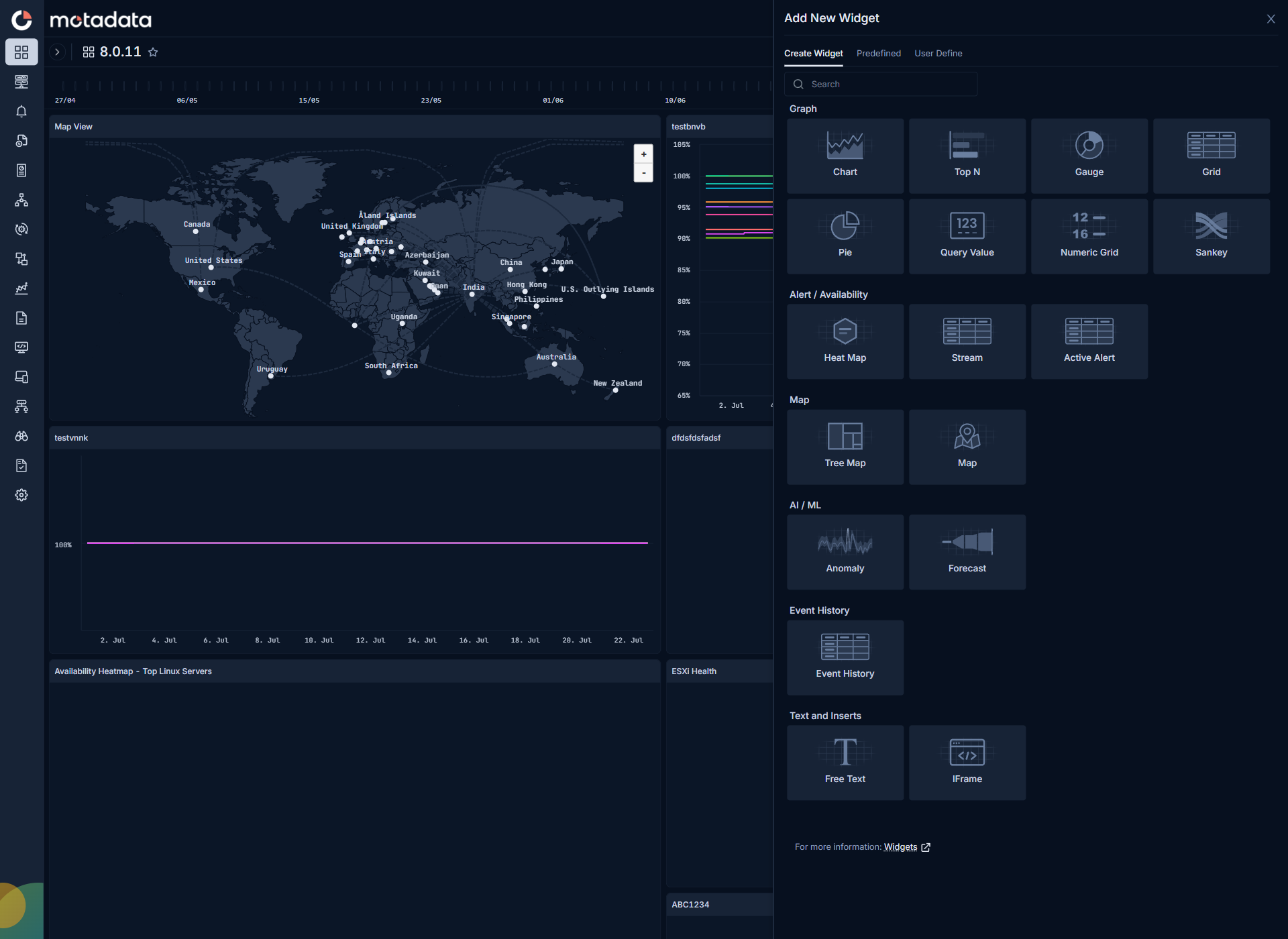
Widget Sources
The panel has three tabs:
| Tab | Description |
|---|---|
| Create Widget | Build a new widget from scratch by selecting a visualization type, querying data, and configuring styling. |
| Predefined | Add a system-provided widget to the dashboard without rebuilding it. Hover over any predefined widget to see its usage count — the number of dashboards it already appears on. |
| User Define | Add a previously created user-defined widget. Hover over any widget to see its usage count and the dashboards it is used on. |
Widget Types
ObserveOps provides the following widget visualization types, organized by category:
Graph
| Type | What It Shows |
|---|---|
| Chart | Metric values over time as a time-series graph. |
| Top N | A ranked list of monitors by highest or lowest metric value. |
| Gauge | A single metric value on a relative scale with threshold bands. |
| Grid | Metric or availability data in a tabular format, grouped by a key value. |
| Pie | Metric distribution across monitors as a pie chart. |
| Query Value | A single computed metric value displayed as a number. |
| Numeric Grid | A compact grid showing metric values across monitors in a numeric tabular format. |
| Sankey | Network flow volume between sources and destinations as flow-width arrows. |
Alert / Availability
| Type | What It Shows |
|---|---|
| Heat Map | Monitors color-coded by their current highest-severity active alert. |
| Stream | A live feed of alerts as they arrive, newest first. |
| Active Alert | A list of all currently active alerts across your infrastructure. |
Map
| Type | What It Shows |
|---|---|
| Tree Map | Hierarchical data as nested rectangles, sized by metric value. |
| Map | Device locations and data plotted on a geographic world map. |
AI / ML
| Type | What It Shows |
|---|---|
| Anomaly | Metric behavior analyzed for automated anomaly detection. |
| Forecast | Projected future metric values based on historical trends. |
Event History
| Type | What It Shows |
|---|---|
| Event History | Raw, unaggregated log events in chronological order. |
Text and Inserts
| Type | What It Shows |
|---|---|
| Free Text | A static text block — use for labels, section headers, or notes on the dashboard. |
| IFrame | An embedded external tool, URL, or dashboard. |
Widget Creation Steps
Select any widget type from the Create Widget tab. The widget creation screen opens. Widget creation follows three steps:
- Select Visualization — choose how data is displayed.
- Query the Widget Data — select the data source and filters.
- Add Styling and Sorting Details — configure appearance and data order.
Troubleshooting
A predefined widget does not appear in the list
Cause: Predefined widgets are configured by your ObserveOps administrator. If none appear, no predefined widgets have been set up for your deployment.
Fix: Create a user-defined widget instead, or ask your ObserveOps administrator to add predefined widgets for your use cases.