ObserveOps Dashboards
Dashboards give you a single-screen view of your infrastructure health. You can combine multiple widgets (charts, grids, gauges, and more) to visualize the metrics, alerts, logs, and flows that matter most to your team.
What You Can Do with Dashboards
| Action | Description |
|---|---|
| View infrastructure health | Use graphical widgets — charts, gauges, heat maps, and tables. |
| Zoom in on time ranges | Contextualize metric spikes and anomalies for a specific period. |
| Change the global timeline | View historical data across all widgets at once. |
| Move and resize widgets | Drag and drop widgets to arrange your layout. |
| Take a snapshot | Record infrastructure state across all widgets at a specific moment. |
| Full screen view | Expand any widget to full screen. |
| Share widgets | Send individual widgets by email. |
| Clone | Duplicate a dashboard or a single widget. |
| Hover for details | Hover over elements on a widget to view more details about the monitors in it. |
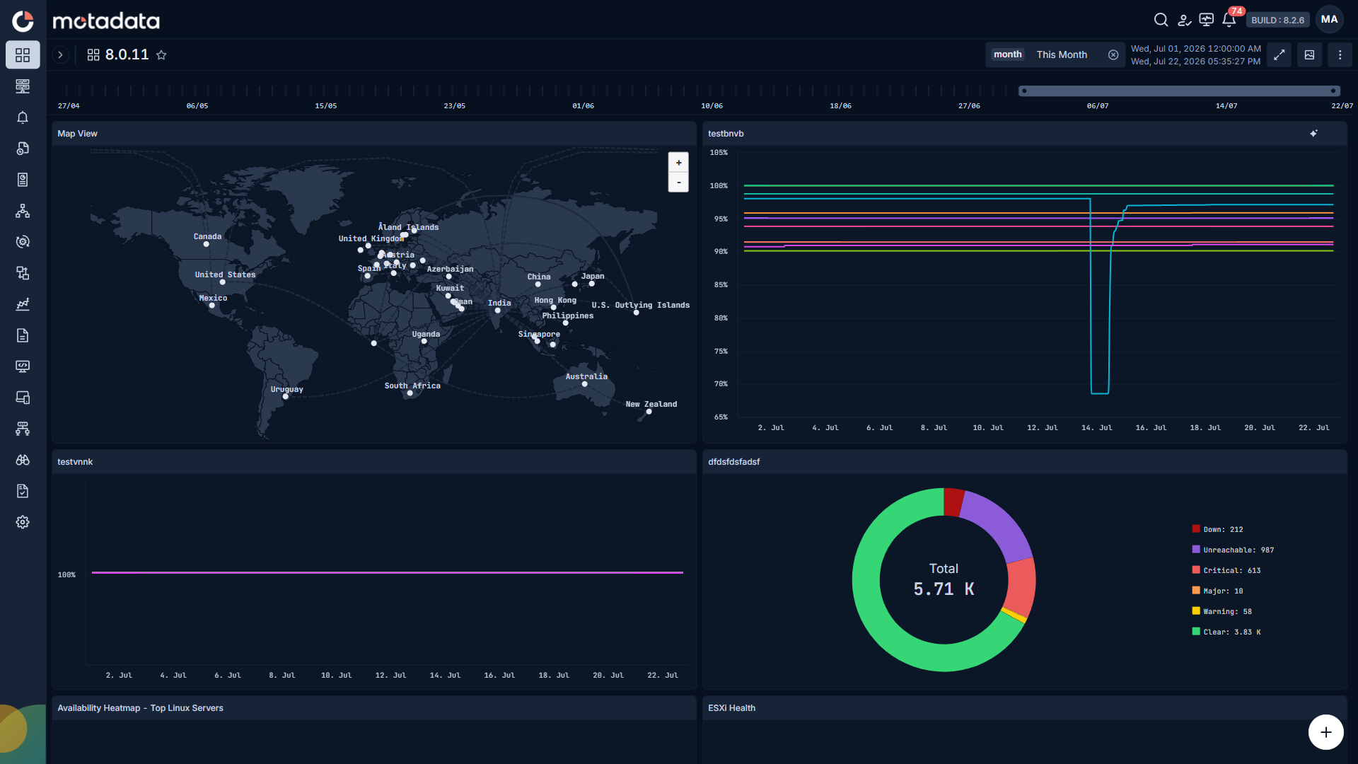
Widgets support a wide range of graph types — pie charts, bar diagrams, lists, gauges, and heat maps — so you can choose the visualization that best fits your data.
The dashboard below shows server details across multiple widgets. Each widget tracks a key performance metric, giving you a health status overview at a glance.
Out-of-the-Box Dashboards
ObserveOps (formerly known as AIOps) includes pre-configured dashboards for common infrastructure types. Categories cover Overview, Server, Network, SDN, Cloud, Virtualization, HCI, Applications, Database, Log, and Flow. These dashboards display key metrics immediately after you connect your infrastructure, with no setup required.
You can use the pre-configured dashboards as a starting point and customize them, or create your own dashboards from scratch.
How Dashboards Work
A dashboard is a canvas that holds one or more widgets. Each widget connects to a data query where you choose the visualization type (chart, grid, gauge, etc.), select the metric or log counter, apply filters, and configure the display. The dashboard polls your data at each widget's configured interval and updates the display automatically.
You can create separate dashboards for different use cases — one for AWS cloud metrics, one for disk utilization, one for network flows — and switch between them from the dashboard selector panel.
Navigating to Dashboards
Go to Main Menu and select Dashboards.
The dashboard selector panel opens on the left side of the screen. It lists all available dashboards grouped by category, with a count per category. Select any dashboard from the list to open it.
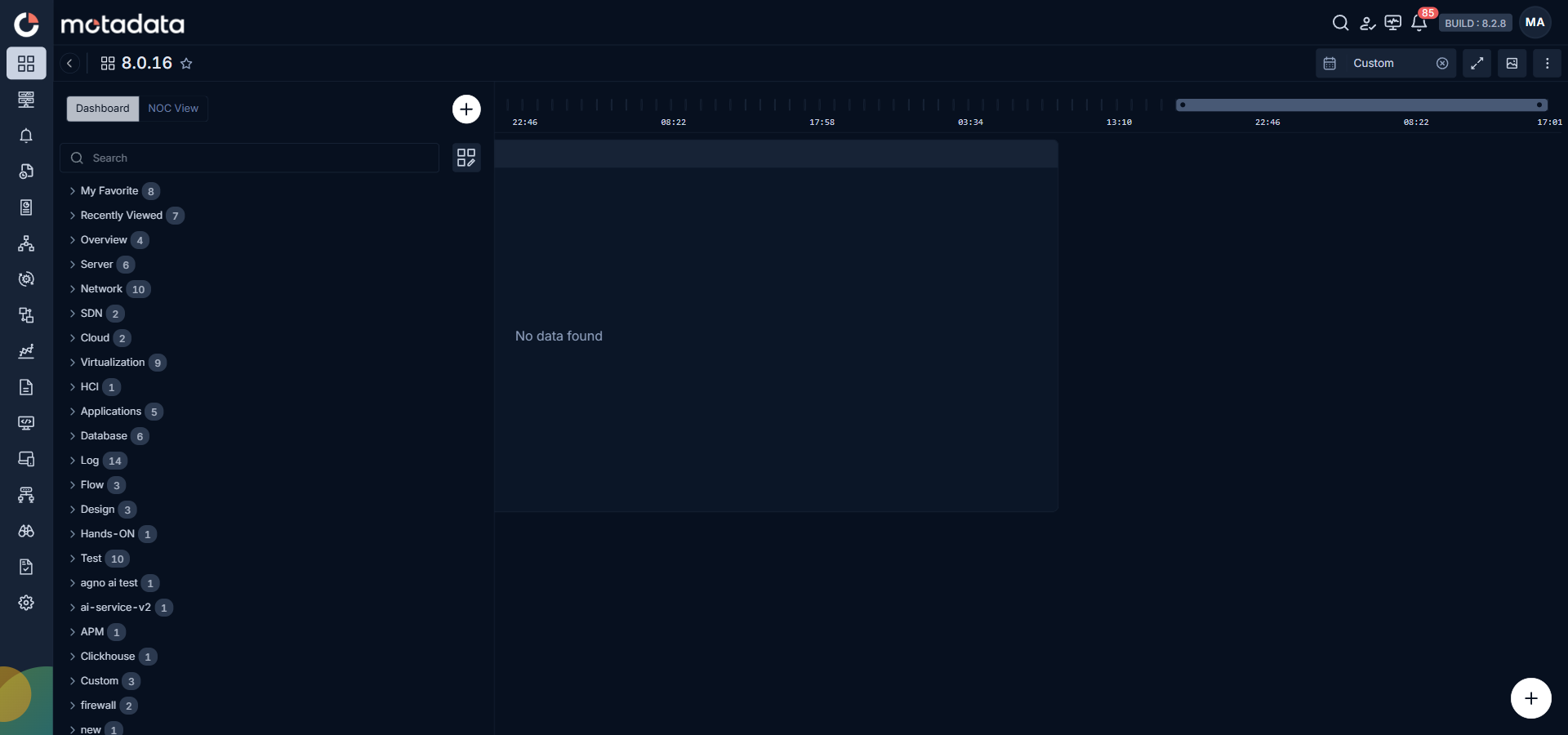
The panel has two tabs at the top:
| Tab | What It Shows |
|---|---|
| Dashboard | All available dashboards, grouped by category. |
| NOC View | All configured NOC Views for auto-rotating dashboard playback on large screens. |
Below the tabs, the panel includes:
| Control | What It Does |
|---|---|
| Search | Filters the dashboard list by name across every category. Use it to jump to a dashboard when you know part of the name. |
| Manage Categories | Opens a side panel to rename or reorder dashboard categories. |
| My Favorite | Lists every dashboard you have marked with the star icon. Use it to keep the dashboards you open most often at the top of the panel. |
| Recently Viewed | Lists the dashboards you have opened recently, most recent first. Use it to reopen a dashboard without scrolling through categories. |
Select + in the top-right corner of the panel to create a new dashboard. See Create a Dashboard for the full steps.