Querying Widget Data in ObserveOps Dashboards
Querying is the second step in widget creation. After you choose a visualization, you define what data appears on the widget — which group, which counter, which devices, and how the values are aggregated and grouped.
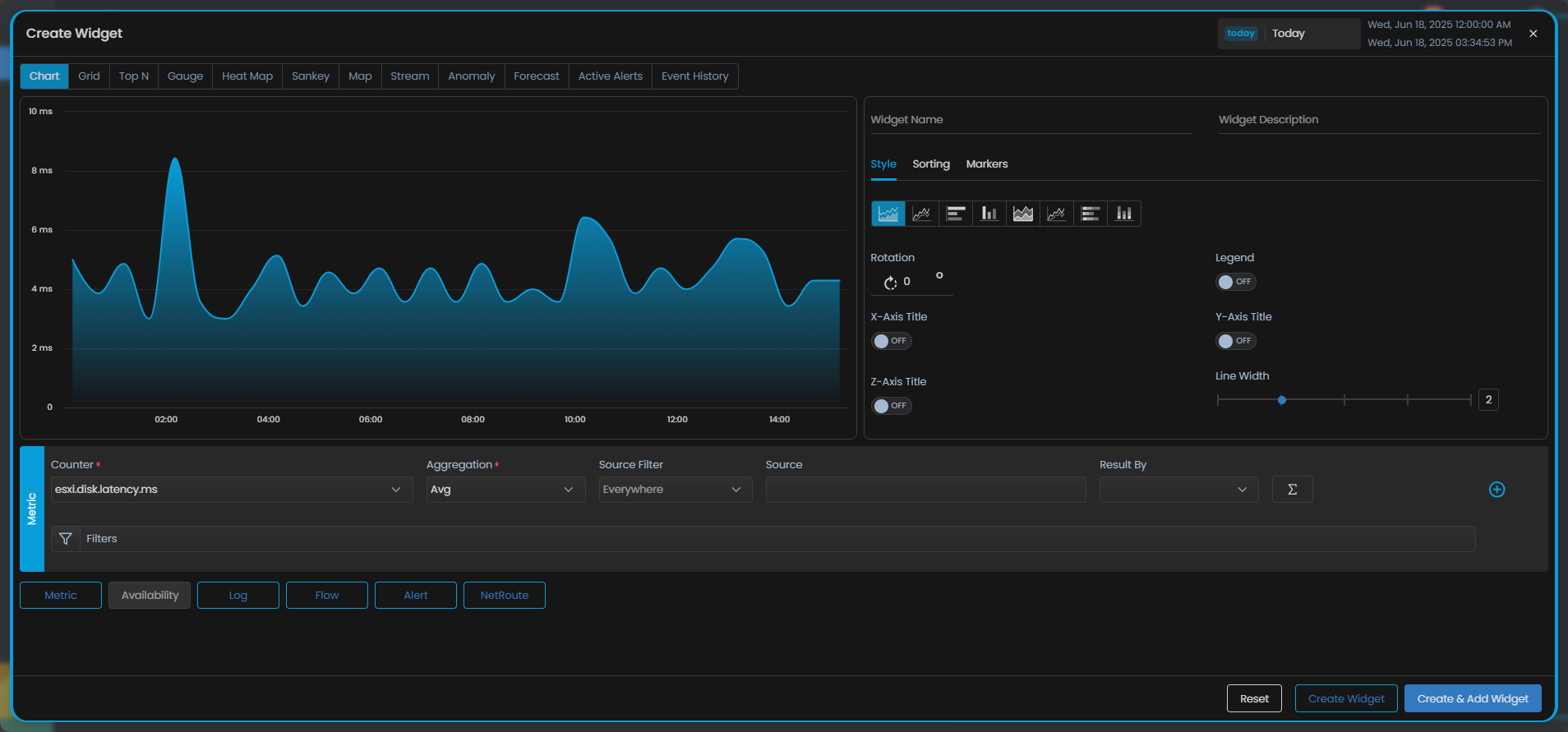
This section continues with the example of a Chart widget used to view the disk latency of all ESXi monitors over time.
Select Group
Choose the data category you want to display on the widget. The following groups are available:
| Group | Description |
|---|---|
| Metric | Query performance metrics collected from monitors. |
| Availability | Query availability status data from monitors. |
| Log | Query counters derived from log data ingested by monitors. |
| Flow | Query counters derived from network flow data. |
| Alert | Display alert data associated with monitors. |
| APM | Display application performance monitoring data. |
| NetRoute | Display network route data. |
| RUM | Display Real User Monitoring (RUM) data from front-end sessions and page loads. |
- Sankey visualization only supports the Flow Group.
- Heat Map visualization only supports the Alert Group.
- You cannot combine Availability Group with any other group on the same widget.
For widgets using Chart visualization, you can add multiple groups. For example, combine the Metric Group with the Alert Group to see metric values and their associated alerts on the same chart.
Select Counter
After selecting the group, choose the specific counter (metric) to display on the widget.
Select the Select Counter dropdown and type to search for the counter. If you don't know the exact counter name, use the Metric Explorer to browse available counters, or check the integrations list for metrics available for your monitor type.
Continuing the example, select the metric esxi.disk.latency.ms to query the disk latency of all the ESXi monitors in the system.
Select the Aggregate Function
After selecting the counter, select the aggregation function. This option appears next to the Counter dropdown. By default, it is set to Avg, which calculates the average of all available polling values of the selected metric in the selected time range.
| Function | Behavior |
|---|---|
| Avg | Calculates the average of all polling values in the selected time range. |
| Min | Returns the minimum polling value. |
| Max | Returns the maximum polling value. |
| Sum | Sums all polling values. |
| Count | Counts the number of polling values. |
Each function aggregates across all polling values collected within each plotted time interval, then plots the result as a single point on the widget.
Select Source Filter
After selecting the group and counter, select the source device for which you want to display the data.
Select the Everywhere dropdown to narrow the scope:
| Source Filter | Description |
|---|---|
| Monitor | Select one or more specific monitors as the data source. |
| Group | Select one or more groups. All monitors in the selected groups are included as the data source. |
| Tag | Select one or more tags. All monitors with those tags are included as the data source. |
If you don't specify a source filter, the widget queries data from all monitors in the system that have the selected counter.
Result By — Grouping on the Widget
Result By controls how data points are grouped on the widget after aggregation. This option appears below the aggregate function selection.
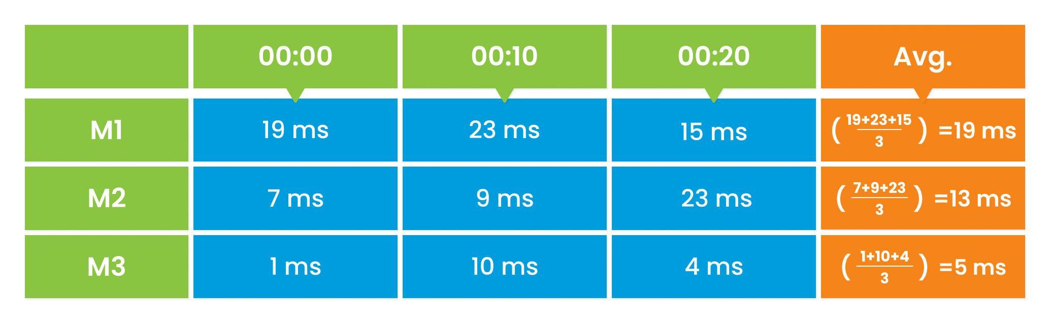
To understand the difference, consider three ESXi monitors M1, M2, and M3, each reporting esxi.disk.latency every 10 minutes.
Without Result By (no grouping): The aggregate function applies across all three monitors together. With Avg, all three monitors contribute to one averaged line on the chart.

With Result By set to Monitor: The aggregate function applies to each monitor separately. M1, M2, and M3 each produce their own line on the chart.
Apply an Arithmetic Operation
Arithmetic operations transform the aggregated values before they are plotted, so you can enrich the visualization with derived series such as differences, log scales, or smoothed averages. Arithmetic operations become available only after you have picked a counter and an aggregation.
Select the sigma icon  next to the Result By field to open the operation list.
| Operation | What It Does |
|---|---|
| Value Difference | Plots the difference between each value and the previous value. Use it to see how much a metric changed from one poll to the next. |
| Monotonic Difference | Plots only positive differences between consecutive values, ignoring drops. Use it for counters that reset to zero, such as bytes-transferred counters after a device restart. |
| Log 2 | Plots the base-2 logarithm of each value. Use it to compress a wide value range into a readable chart. |
| Log 10 | Plots the base-10 logarithm of each value. Use it when values span several orders of magnitude. |
| Moving Average 3 | Plots the rolling average of the current value with the previous 2 values. Use it to smooth short-term noise. |
| Moving Average 7 | Plots the rolling average of the current value with the previous 6 values. Use it for medium-term smoothing. |
| Moving Average 15 | Plots the rolling average of the current value with the previous 14 values. Use it to reveal long-term trends. |
Apply a Filter
Filters narrow the set of metric values that reach the aggregation step. Use filters to include only a subset of values, or to exclude values you do not want on the widget. Filtering runs before aggregation and grouping, so the aggregate function operates only on the values that pass the filter.
Continuing the example, if some ESXi disks belong to test servers and should not affect the production dashboard, add a filter to exclude those disks. The remaining disks are then aggregated and plotted.
For details on the filter controls and syntax, see the Common UI elements across the platform reference.