View and Analyze Service and Traces
Once trace data is ingested into Motadata ObserveOps (formerly known as AIOps), it becomes available for visualization and analysis in the APM Explorer section.
Visualize an Ingested Service Trace
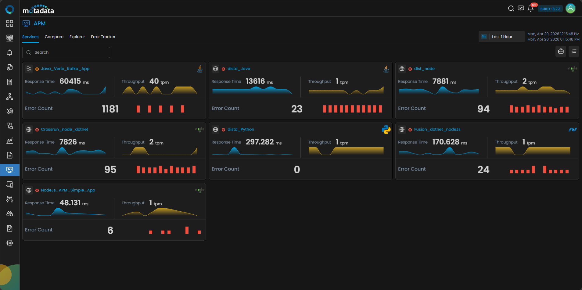
Motadata ObserveOps facilitates visualization of ingested Traces using APM Explorer's service dashboard. You can have bird eye view of services' performance from the dashboard displaying grid or tile card.
Navigation
Go to the APM Explorer section from the main menu. Click on Service to view all registered services. Each service tile includes quick insights such as Business Group Name, Severity Indicators, Response Time, Throughput, and Error Rate.
For Severity Indicators, you can check the severity by the indicating colors or hovering over the indicator you can see if it is Unknown, Major, Critical, Warning or Clear.
You can click the Business Service icon in the top right side corner to view the grouped service according to the specific business services.
Clicking the service group will display different services registered under business services. Clicking the service tile will display the same tabs as normal service tiles.
You can also switch to a Grid View by clicking the grid icon at the top-right corner of the services screen. The grid view lists all registered services in a tabular format, making it easier to compare services at a glance.

Clicking any service name from the grid view drills down into the same detailed analytics as clicking a service card — displaying the Overview and Transactions tabs for that service.
The grid view includes filter options at the top of the screen. The filters displayed by default are the only filters available for matching in this view. You can hide or unhide the filter panel by clicking the Filter icon.
You can click on any service tile to view in-depth analytics. i.e., Overview tab and Transactions tab.
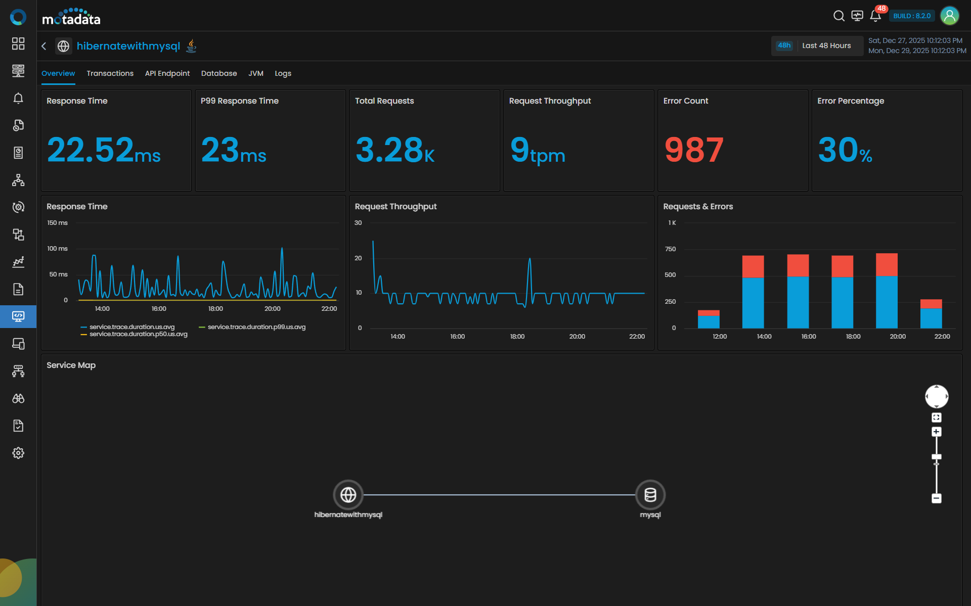
The Overview tab displays Service Map, Request & Errors, Latency and Error Count. Clicking the Transactions tab displays details like Trace Count, Trace Duration, Trace With Errors and a grid.
Overview Tab Visualization
The Overview tab contains several key visual components:
| Visualization | Description |
|---|---|
| Service Map | Service Map will display all the entities with which the selected service interacts with severity indicators. For e.g. if you have added the payment service, the service will display the DB service, queueing service, and caching layer in the map. The Service Map also allows you to identify response time and error rate with each of the entity individually by hovering over it. |
| Requests & Errors | It is a single stack bar chart, where blue region indicates the total number of requests and the red region indicates the number of errors. |
| Response Time | The latency tile along with display the aggregated average latency will also display the aggregated percentile. You can view results by 99th percentile values (P99) or 50 percentile values (P50). The P99 aggregation will help in identifying the top outliers, while P50 will act as a median range, that will allow you to bifurcate services with least latency and highest latency. |
| Error Count | The Error Count is displayed in a time series chart that represents error rate in percentage value against the time of the day. |
Transactions Tab Visualization
![]()
The Transaction tab contains several key visual components:
| Visualization | Description |
|---|---|
| Trace Count | Displays the total number of count of Traces generated at given time of the day. |
| Trace Duration | Depicts the total duration for each root span to get completed. The values on Y-axis are in milliseconds. |
| Trace with Errors | Showcases the number of errors encountered by each root span over a time period. |
Each line on the line-chart represents an individual root span of the service.
In the bottom section of the screen you can find the details of all the root span(s) of the service.
| Field | Description |
|---|---|
| Root Span | Displays the name of the root span for the trace. |
| Traces | Lists number of traces associated with the root span. |
| Spans | Displays the total number of spans within the trace. |
| Trace Duration | Indicates the total time taken for the trace execution. |
| Error Count | Displays the number of errors that occurred during the trace execution. |
Clicking on a Root Span from the list opens further details.

| Field | Description |
|---|---|
| Response Time Distribution | Displays response times for the selected root span in a scatter plot. A light-to-dark color gradient indicates density: lighter shades mean fewer traces, darker shades mean more traces. |
| Trace Name | List of all associated span(s). |
| Start Time | This column comprises the timestamp of when a trace was generated. |
| Trace Duration | The total time it took for the request to be completed. |
| Entities | Total number of external services the span(s) interacted with. |
| Spans | Total number of spans the Trace consists. |
| Errors | Errors faced in the journey of Trace. |
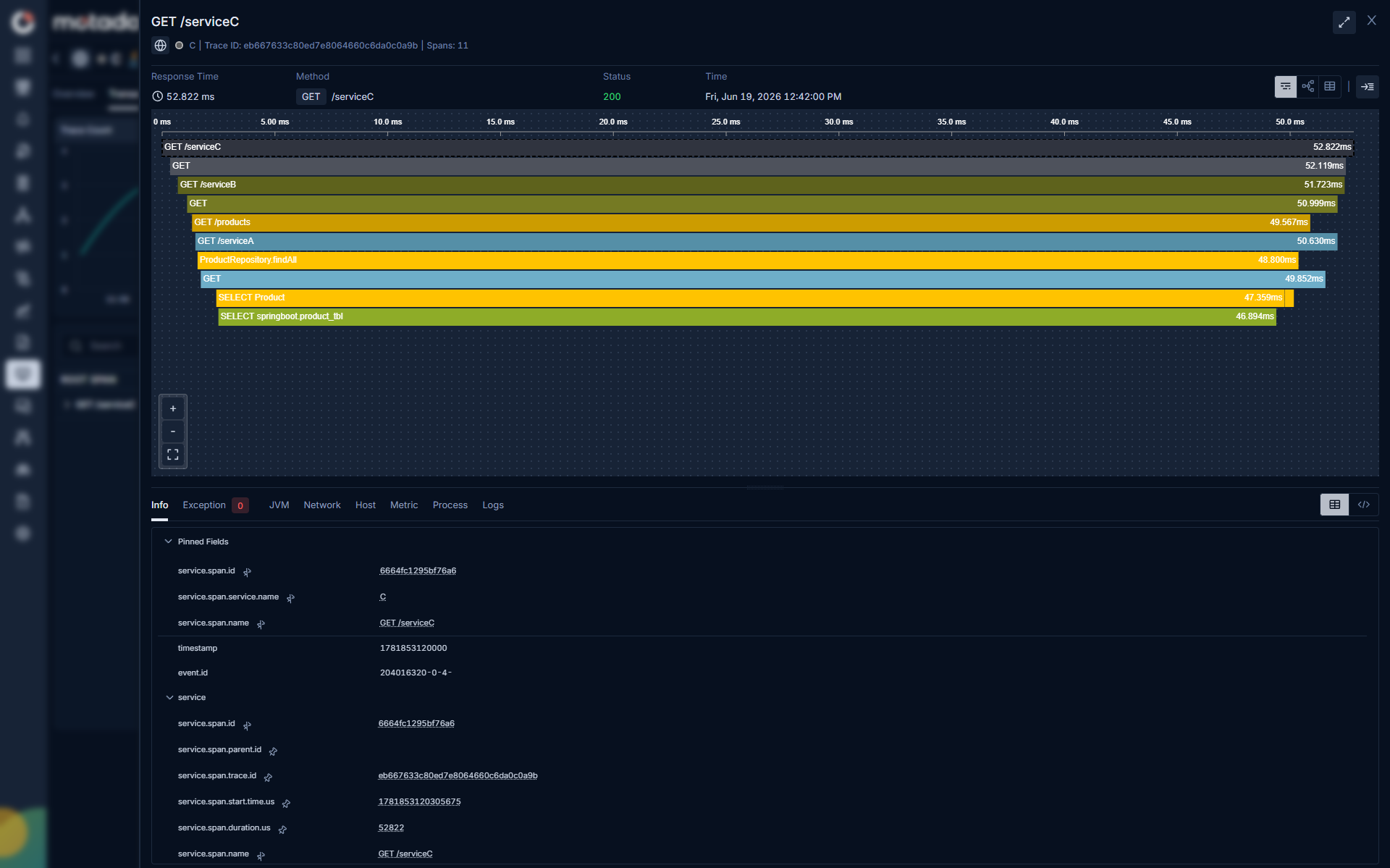
Analyze Root Span Using Flame Chart
Click on a Trace Name to view its complete journey, and use the drill-down menu to explore in-depth insights for that trace.

The Flame chart will showcase the complete journey of the request depicting the root span and the child spans and along with the total duration of the Trace and how much time each span took.
Below is a gist for the visualization to understand:
| Field | Description |
|---|---|
| Info | When you select a particular span, the method responsible to invoke the span will be displayed in this section. |
| Exception | If root span or any child span encountered an error, it will be displayed over in this section. |
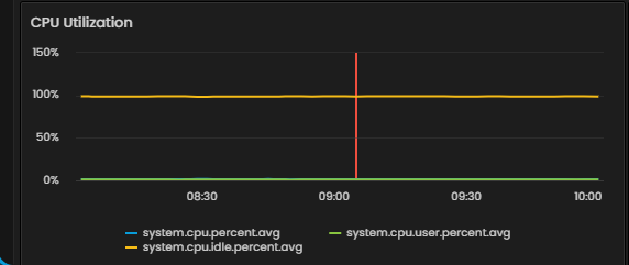
| JVM | This tab displays JVM runtime analytics for the traced service CPU utilization, memory utilization, and Thread stats. |
| Network | This tab will house the network details (TCP Connection States, TCP Sync, TCP Open Connections, and Network Traffic Summary) from which the root span originated. |
| Host | This tab will house the host details (CPU usage, Memory usage, Load Average, Disk utilization and Disk I/O Summary) from which the root span originated. |
| Metric | You can find time series charts of Requests & Errors and Latency for the span(s) will be available in this tab. |
| Database | This tab displays the charts with database related details like Connection Utilization, Active Users, Active Connections, Active queries and waiting queries, Lack connection KPIs, Buffer/ Cache Efficiency and etc. |
| Process | This tab will house the process details (Process CPU usage, Process Memory usage, and Process Virtual Memory Bytes) from which the root span originated. |
| Logs | This tab shows correlated application logs for the same service, auto-filtered to ±15 minutes around the trace time, in a searchable table (timestamp, and message). |
The Host and Metric tabs display a chart view that includes a red vertical line representing the current time. The chart visualizes metric values for a 2-hour window that shows data from one hour before and one hour after the trace was received.
Data Security with Motadata APM
If you want to remove PII from the info tab, where the keys are displayed then follow the below steps :
Open 'otel-config.yaml' in path /motadata/motadata.
Add below config in yaml :
processors:
  attributes/remove:
    actions:
      - key: db.statement
        action: delete
      - key: http.user_agent
        action: delete
      - key: account_password
        action: delete
- Attach Processor to the Traces Pipeline in same yaml.
service:
  pipelines:
    traces:
      receivers: [otlp]
      processors: [attributes/remove]
      exporters: [otlp]
Now restart the motadata-agent.
You can also analyze the trace name by topology or grid view by clicking the respective icons in the top right corner. Also, you can have an expanded look for the spans displayed in the chart by clicking the expand icon.
Pin Frequently Used Trace Fields
The trace details panel in the drill down menu, shows many fields across multiple sections. You can pin the fields displayed under the info tab.
Pin the fields you check most often so they appear at the top of the panel every time you open a trace without scrolling or expanding sections.
Pin a Field
Open any trace in APM Explorer. In the trace details panel, hover over the field you want to pin and click the Pin icon that appears next to the field name.
The field moves to the Pinned Fields section at the top of the details panel.
Unpin a Field
Open a trace. In the Pinned Fields section, hover over the field you want to remove and click the Unpin icon.
The field returns to its original section in the panel.
Database Tab Visualization

The Database tab provides visibility into database operation performance for a selected service. It helps you understand how your application interacts with the underlying database by displaying key execution statistics and response times for different operations.
At-a-glance KPIs (table metrics)
| Column | What it indicates |
|---|---|
| Operation Name | Displays the name of the database operation being monitored. |
| Total Requests | The total number of database requests initiated for each operation during the selected time range. |
| Error Count | Shows the number of failed requests or exceptions encountered for that operation. A higher count may indicate database connectivity or query issues. |
| Min Response Time | The shortest recorded response time for the operation. This reflects the best-case latency observed. |
| Max Response Time | The longest recorded response time for the operation . Spikes here often signal query-level bottlenecks or high load conditions. |
| Avg Response Time | The average time taken to complete the operation. This provides an overall view of query performance trends. |
| View Query | You can click the View Query hyperlink to see the details about the particular query. |
You can filter the grid by the following Database Operation Type.
| Attribute | Description |
|---|---|
| All | Shows every database operation regardless of type (the default view). No filtering applied. |
| Select | Shows only read operations (queries that fetch data). e.g. SELECT master.qrtz_TRIGGERS. |
| Insert | Shows only insert operations (new records being written). |
| Update | Shows only update operations (existing records being modified). e.g. UPDATE master.qrtz_SCHEDULER_STATE. |
| Delete | Shows only delete operations (records being removed). |
Use Case
This tab allows quick diagnosis of query-level latency, transaction failures, and database responsiveness.
JVM Tab Visualization

The JVM tab surfaces runtime analytics for Java services—CPU, memory, class loading, garbage collection, and threads—so you can quickly diagnose performance issues for Java only.
At-a-glance KPIs (top tiles)
| Tile | What it indicates |
|---|---|
| JVM CPU Utilization | Average CPU usage (%) of the service JVM over the selected time range. |
| JVM Memory Utilization | Current JVM used memory within the range (MB). |
| JVM Loaded Classes | Total number of classes currently loaded. |
| JVM Unloaded Classes | Classes unloaded since JVM start or within the time window (implementation-dependent). |
Trend charts
| Chart | Series | Notes |
|---|---|---|
| JVM CPU Utilization (trend) | Percentage CPU | Time-series of average CPU usage; use hover to inspect points. |
| JVM Threads (trend) | Live, Daemon, Sleeping | Line chart to spot thread growth, spikes, or stalls. |
Detail panels
| Panel | What you get |
|---|---|
| JVM Heap Memory Details | Per region (Eden, Old Gen, Survivor): Committed, Min, Max, Avg, and Limit (MB) to gauge pressure and headroom. |
| JVM Non-Heap Memory Details | Code Cache, Metaspace, Compressed Class Space and codeheaps (profiled/non-profiled): Committed, Min, Max, Avg, Limit (MB). |
| JVM Garbage Collection Details | For each GC type (e.g., Young/Concurrent/Old): GC Action Name, GC Count, GC Total Time Spent—use to correlate pauses with latency. |
| JVM Class Count Details | Loaded vs Unloaded class counts with Min/Max/Avg—useful for detecting classloader churn or leaks. |
| JVM Threads Details (table) | Timestamped snapshot of Live, Daemon, and Sleeping thread counts with a quick search to pinpoint anomalies. |
Use Case
- Rising CPU with stable threads often points to CPU-bound work; rising threads may indicate contention or leaks.
- Increasing Old Gen usage or frequent GC time spikes usually correlates with latency outliers.
- Growth in Loaded Classes without unloads can signal classloader leaks (e.g., hot-reloading issues).
You can select the time range from the top-right corner to focus analysis (e.g., Last 1 Hour) that helps in RCA as well.
Logs Tab Visualization

The Logs tab lets you explore application logs for the selected service with a time-series histogram and a customizable table. Providing Pre-Filters you can search the histogram.
You can see the Selected and Available Fields in the Event Log section. Timestamp and Message are the default fields. Selecting the field section expands and displays all details.
There are options to Export as CSV and Save as Report in the top right side corner of the table.
Correlation from Traces: When opened from Trace drill-down to Logs, this view is auto-filtered to the same service and ±15 minutes around the trace timestamp to provide immediate context.