Widget Styling and Sorting in ObserveOps Dashboards
Styling is the third step in widget creation. After you configure the visualization and query, you control how the data is displayed — chart type, axis labels, granularity, column order, thresholds, and more.
The right panel on the widget builder has four tabs. The available options in each tab depend on the visualization type you selected.
| Tab | What It Controls |
|---|---|
| Style | Visualization type, axis titles, legend, line width, point display, granularity, metric grid, and other chart or table specific styling. |
| Sorting | Whether the widget shows the Top or Last N results, and the Count of results shown. |
| Markers | Threshold markers drawn on the chart, such as horizontal reference lines for warning or critical values. |
| Timeline Preference | Whether the widget follows the global dashboard timeline. Enable Use Custom Sticky Timeline to give this specific widget its own fixed range that does not change when the dashboard timeline changes. |
- Chart-Based
- Grid-Based
- Gauge
- Sankey
- Map
- Free Text
Chart-based widgets share the same core styling options. Select a widget type below for specific details.
- Chart
- Top N
- Anomaly / Forecast
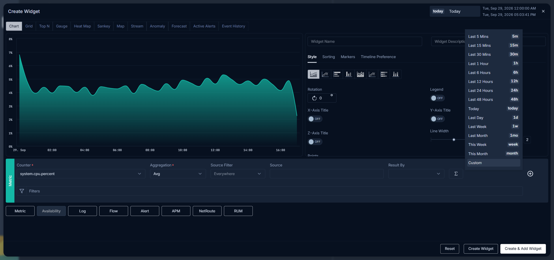
Select Chart Type
Choose how the chart displays data:
- Area Chart
- Line Chart
- Horizontal Bar Chart
- Vertical Bar Chart
- Stacked Area Chart
- Stacked Line Chart
- Stacked Horizontal Bar Chart
- Stacked Vertical Bar Chart
Chart Legend
Toggle Legend on or off to show or hide the chart legend.
Axis Titles
Enable the X-Axis Title, Y-Axis Title, or Z-Axis Title toggle to display axis labels. Enter the label text in the field next to each toggle. For example, set the X-Axis title as Time and the Y-Axis title as Latency.
To improve readability when multiple data points crowd the X-axis, enter a rotation angle in the Rotation field to tilt the X-axis labels.
Line Width
Adjust the Line Width slider to control the thickness of chart lines. For line chart types, choose between Solid or Dash line style. With Dash selected, set the line spacing for your visualization.
Points
Enable the Point toggle to display data point markers on the chart. Set the Point Size after enabling the toggle.
Data Granularity
Granularity controls the spacing between data points on the chart. Enter a value to set how far apart consecutive data points are plotted.
Granularity ranges from 1 to 3600 seconds, or 1 to 1440 minutes. If you enter a value lower than the polling interval for the metric, ObserveOps automatically adjusts the granularity to match the polling interval.
Metric Grid
Enable the Metric Grid toggle to display a summary grid below the chart. Select which values appear in the grid: Avg, Min, Max, and/or Sum.
Sorting Data Points
| Option | Description |
|---|---|
| Top | Sort data points in descending order, showing the highest values first. |
| Last | Sort data points in ascending order, showing the lowest values first. |
| Count | Set how many data points display on the widget. |
Markers
Add threshold markers to call out specific values on the chart:
| Option | Description |
|---|---|
| Type | Select Line to mark a single value, or Range to mark a range between two values. |
| Threshold | Enter the threshold value or range boundary. |
| Color | Choose the color for the marker. |
| Line Type | Select Dash, Solid, or Solid Bold for the marker line style. |
| Label | Enter a label to display on the marker. |

Top N widgets use the same core styling options as Chart widgets. Refer to the Chart tab for the full option list.
Sorting Top N
| Option | Description |
|---|---|
| Top | Sort in descending order, showing the monitors with the highest values first. |
| Last | Sort in ascending order, showing the monitors with the lowest values first. |
| Count | Set how many monitors display on the widget. |
Anomaly and Forecast widgets use the same styling options as Chart widgets. Refer to the Chart tab for the full option list.
Grid-based widgets share the same core styling options. Select a widget type below for specific details.
- Grid
- Event History

Column Order
Drag columns in the Column Setting tab to reorder them. Drop a column in the position you want it to appear on the widget.
Add a Tag as a Column
Select a key-value tag from the dropdown to add it as a column in the grid. Tags you select appear in the Column Setting tab.
Column Display Name
Enter a custom name in the Display Name field next to a column to change how it appears as a header on the widget.
Hide a Column
Select the Hidden checkbox next to a column in the Column Setting tab to remove it from the widget view without deleting it from the configuration.
Column Configuration
Select Configure next to any column to open the column configuration pop-up:

| Option | Description |
|---|---|
| Resizable | Enable to allow column width resizing by drag and drop in the widget view. |
| Sortable | Enable to allow sorting the widget rows by this column's values. |
| Orderable | Enable to allow repositioning this column by drag and drop in the widget view. |
| Width (%) | Enter the column width as a percentage of the total widget width. |
| Add Color Configuration | Set color rules based on threshold values for this column. |
| Add Value Configuration | Add a prefix or suffix to values in this column based on threshold conditions. |
| Icon | Choose an icon to display alongside values in this column. |
| Icon Position | Set the icon to appear before or after the value. |
Column Header Size
Select a font size from the Header Font Size dropdown in the Style tab to control the column header text size.
Event History widgets use the same styling options as Grid widgets. Refer to the Grid tab for the full option list.
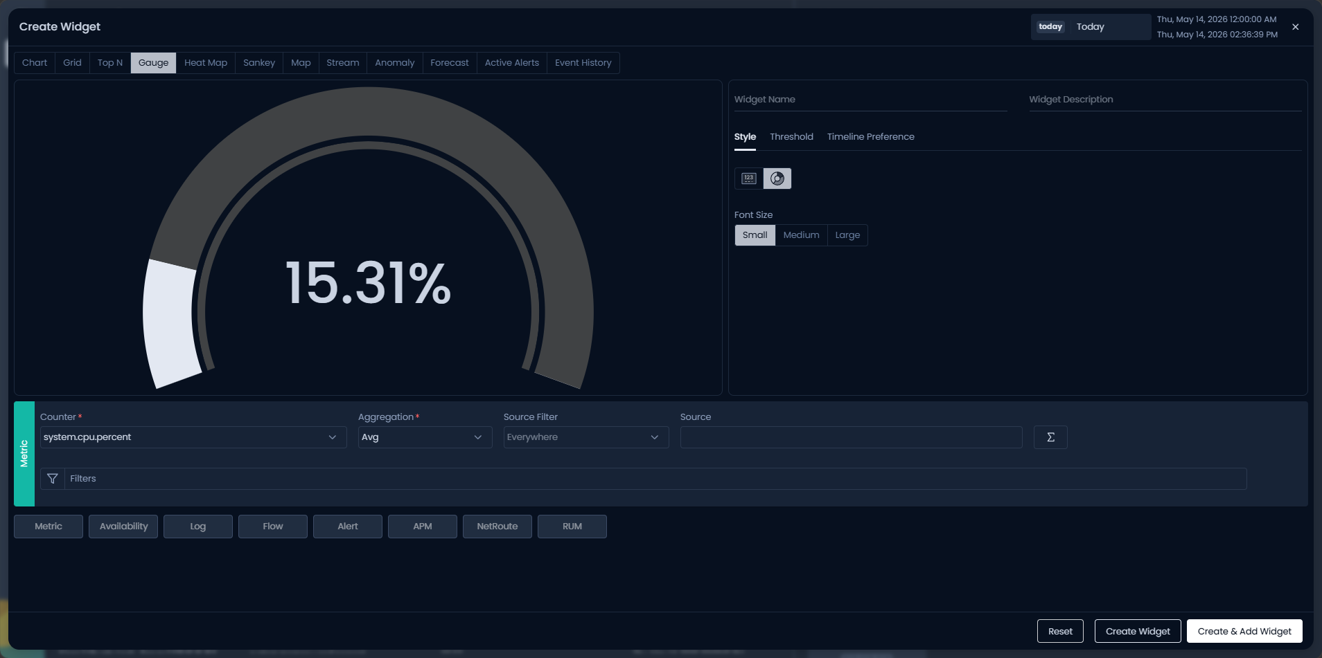
Gauge Type
| Gauge Type | Description |
|---|---|
| Metro Tile | Display the metric value as a colored tile. |
| Solid Gauge | Display the metric value on a solid arc-style scale. |
Gauge Thresholds
Define threshold bands in the Threshold tab. Each band sets a color range that the gauge displays based on the current metric value — for example, green for normal, yellow for warning, and red for critical.

Drag and drop the component tiles in the Style tab to reorder the elements of the Sankey diagram to match your preferred view.

Select a map display type from the Style tab:
Map
Trace the path of log and network flow data from source to destination on a world map.
Tree View
Display the relative volume of log, flow, or alert data per country or city as proportional nodes. Larger nodes represent higher data volumes relative to the total.
Bubble Chart
Display data volume per country or city as bubbles. Larger bubbles indicate higher data volumes, providing a clear visual comparison across locations.
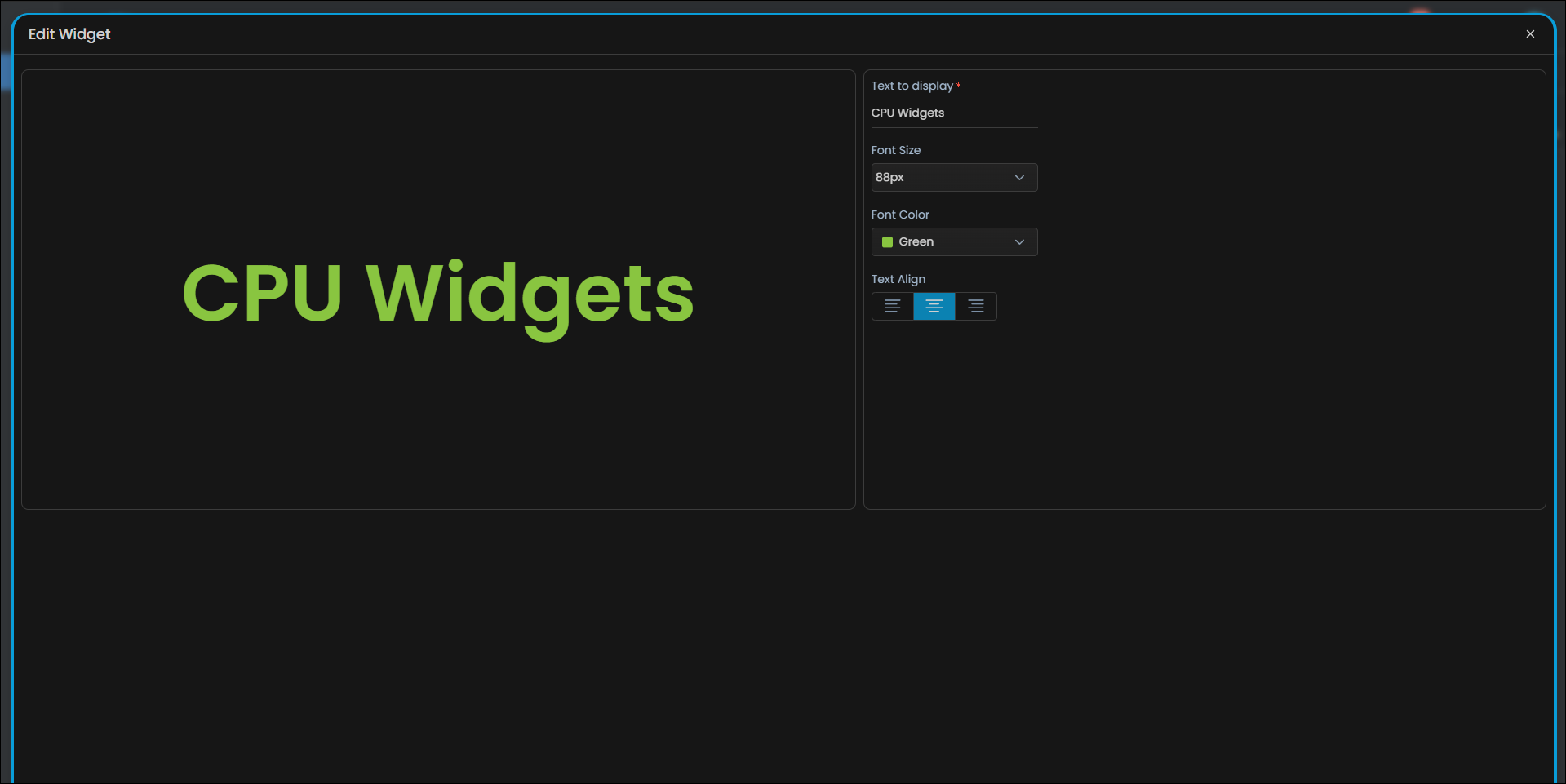
| Option | Description |
|---|---|
| Text to Display | Enter the text to show on the label. |
| Font Size | Choose a preset font size or select Auto to scale the text to the widget size. |
| Font Color | Choose a color for the text. Default is white. |
| Text Align | Select the text alignment: left, center, or right. |
Troubleshooting
Granularity resets to a higher value than you entered
Cause: The value you entered is lower than the polling interval for the selected metric. ObserveOps automatically adjusts granularity to the polling interval to prevent empty data points.
Fix: Check the polling interval for the metric in the monitor configuration. Set granularity equal to or higher than that interval.
Column order changes do not save on the Grid widget
Cause: The Orderable toggle may be disabled for the columns you are trying to reorder in the live widget view.
Fix: Open the widget editor, go to column Configure, and enable the Orderable toggle for the columns you want to reorder.