Left Navigation
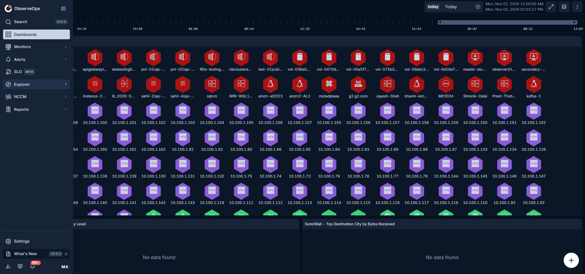
The left navigation is the single, persistent entry point to every workflow in ObserveOps. It is designed to keep the most frequently used modules one click away for every user, surface deeper modules through compact flyouts so the rail stays short, and let each user personalise the order and visibility of modules by pinning the ones they open most. Settings, product health, release updates, pending approvals, notifications, and the user profile sit in a fixed footer so the operational tools stay stable while the module list stays customisable.
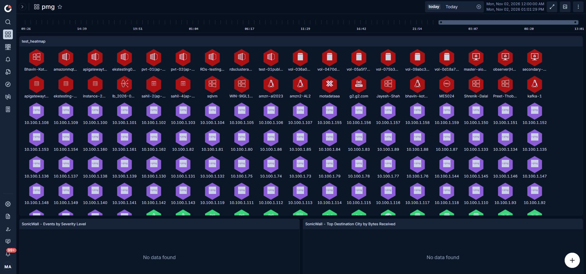
Header
The sidebar header carries the product logo, the Expand navigation / Collapse navigation toggle that shrinks the rail to an icon-only strip, and a Search control (keyboard shortcut Ctrl + K) that opens the global search overlay from any page.
Static Modules
Dashboards, Monitors, Alerts, Explorer, and Reports are the five static modules. They always appear in the primary rail in this order regardless of how the user customises the sidebar, so every operator finds the same baseline on first login and on every subsequent session.
| Module | Behaviour |
|---|---|
| Dashboards | Opens the Dashboards module directly. |
| Monitors | Opens the Monitors flyout. The flyout lists every monitor type (Inventory, Network, Server & Apps, Storage, Virtualization, Cloud, Container, Service, Process, Interface, WAN Link, and so on). |
| Alerts | Opens the Alerts flyout grouped by signal source (Metric, Log, Flow, Trap, NetRoute, APM, Network Config, RUM). |
| Explorer | Opens the Explorer flyout with every analytical workspace: Topology, NCCM, NetRoute, Metric Explorer, Log Explorer, APM Explorer, RUM Explorer, Flow Explorer, Trap Explorer, Geo Map, Audit. Nested workspaces are indented under their parent. |
| Reports | Opens the Reports flyout grouped by report family (Metric, Log, Flow, Trap, Audits, NCCM, APM, RUM, NetRoute, Log Compliance). |
Install-specific modules (for example, SLO when the SLO add-on is enabled) also sit in the static group and follow the same open-direct-or-flyout behaviour.
The currently open module stays highlighted in the rail even when the page is reached from a URL instead of the sidebar. A chevron appears only on modules that open a flyout.
Pinning for Personalisation
The Explorer sub-modules are the pinnable set. The pin lets each user promote the workspaces they use most often from inside the Explorer flyout to the primary rail, so the modules that matter to that specific user sit next to the static group and open with a single click. Pins are stored on the user profile, so the same personalised rail appears on every browser and every device the user signs in from.
Pinning a sub-module
- Open the Explorer flyout.
- Hover the sub-module you want to promote. A pin icon appears on the right side of the row.
- Click the outline pin. It fills in to show the item is pinned, and the sub-module appears in the primary rail between Explorer and Reports.
Behaviour of pinned items
- A pinned sub-module that has nested workspaces (for example, APM Explorer) keeps its chevron and opens its own flyout from the rail. The flyout header shows the module name, the count of workspaces, a DOCS link, and a filled pin badge next to the title.
- A pinned sub-module without children navigates directly on click.
- The pinned item stays listed inside the Explorer flyout with its filled pin so the user can locate and unpin it from either place.
- Pinned items follow the Explorer ordering regardless of the sequence in which the user pinned them, so the rail reads the same every time.
- All Explorer sub-modules can be pinned simultaneously.
- A sub-module hidden by the user's role never appears in the rail, pinned or otherwise.
Unpinning
Click the filled pin on either the Explorer flyout row or the pin badge on the pinned item's own flyout header. The item moves back under Explorer in the next render.
In-Context Documentation
Every flyout exposes a DOCS link in two places:
- On the flyout header, next to the module name and sub-module count. Clicking it opens the module's documentation page in a new browser tab.
- On every individual row inside the flyout, revealed on hover. Clicking it opens that specific sub-module's documentation page.
The link is wired per module, so an operator who wants to read about a specific workspace lands directly on the right page without searching the documentation portal first.
Collapsing to Icon Rail
The header Collapse navigation toggle shrinks the sidebar to an icon-only rail. The order, icons, pin state, and active-item highlight stay the same. Hovering any icon shows its label as a tooltip. A toggle on top of the rail expands the sidebar back. The expanded or collapsed state is saved on the user profile and applied on every subsequent login.
Footer
The footer is a fixed set of tools used across every module. Items here are not pinnable or re-orderable — they always render in the same slot so operators always know where to click.
| Footer item | What it does |
|---|---|
| Settings | Opens the Settings area in a secondary sidebar on the right of the primary rail. Settings surfaces every module-wise feature configuration (Monitor Settings, Policy Settings, Discovery Settings, Observability Pipeline, Network Config, Compliance, APM, RUM, Integration, Service Level Objective, and so on) alongside ObserveOps-wide common configuration (My Account, User Settings, System Settings, Utility, Plugin Library). The secondary sidebar has its own search field, its own collapse toggle, and the active group stays highlighted even when the sidebar is collapsed to its icon rail. |
| What's New | Opens the ObserveOps release notes portal in a new tab so operators can see the current release version and the changelog for every prior release. |
| Approval | Opens the Approval screen, which lists every pending change-approval request in a grid along with the request metadata (requester, change type, module, submitted time, and so on). Approvers can act on a request directly from the grid without opening a separate detail page. |
| Health | Opens the ObserveOps Health Monitoring screen that reports the live status of the ObserveOps platform's own services and components. |
| Notification | Shows an unread badge with the current count of unread notifications. Clicking the bell opens the notification panel listing every notification; marking one read decrements the badge. |
| User Profile | Opens the user menu with the signed-in user's display name and the links described in User Profile Menu below. |
If the sidebar height cannot fit every footer slot, What's New and any utility icons fold into an overflow menu. Settings, Notification, and the User Profile always stay inline so the operator never loses access to them.
User Profile Menu
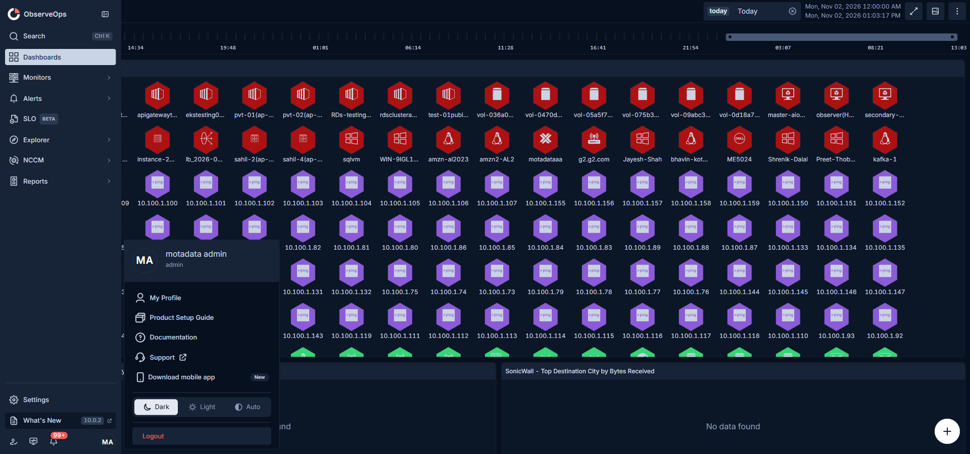
Opening the User Profile from the footer reveals the signed-in user's display name followed by this menu:
| Entry | What it opens |
|---|---|
| My Profile | The current user's profile page under Settings. |
| Product Setup Guide | The product setup walkthrough, which lists the setup tasks and tracks completion. |
| Documentation | The ObserveOps documentation portal in a new tab. |
| Download mobile app | The download prompt for the ObserveOps mobile app. Carries a New badge until the user dismisses it. |
| Theme | A segmented control with Light, Dark, and Auto options. The selected theme applies immediately and is saved to the user profile, so the choice travels with the user across browsers. Auto follows the operating system's theme preference. |
| Logout | Signs the user out of ObserveOps. |
Keyboard
| Action | Keys |
|---|---|
| Move focus through the sidebar, flyouts, and Settings sidebar | Tab, Arrow keys |
| Open or navigate the focused item | Enter |
| Close an open flyout | Esc |
| Open global search | Ctrl + K |
A visible focus ring tracks the active item for keyboard users.
Preferences
Every pin, unpin, collapse, and theme change is persisted on the user profile. On first login (or when the preference service cannot be reached) the sidebar loads with no pins and both the primary and secondary sidebars expanded. If a save fails, the control reverts and an error is shown so the user is never left with an unclear state.