Widget Settings
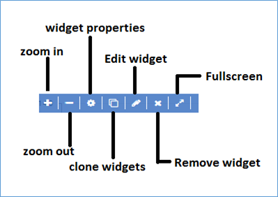
Zoom in You may get zoomed in view of the widget.
Zoom out You may get zoomed out view of the widget.
Widget Properties
The options in widget properties vary with type of widget. Use the information as applicable in the widget.
- Visualization Layout: You may set visualization layout as per your requirement for widget counts for the single row. User can set for the 1 to 6 counts.

- Color: Customize the colors based on the conditions you apply.
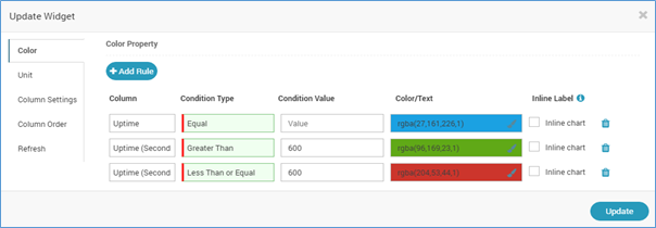
- Unit: Change the unit of the values. You can change the unit using multiple expressions consisting of operators like Division, Multiplication, Addition, and Subtraction.

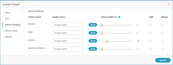
- Custom Settings: You may change the column settings by customizing the width of the column and by hiding few columns.
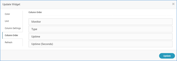
- Column Order: Change the order of columns using drag and drop.
- Refresh: Set the refresh rate.

- Extra Column: [ONLY FOR Metric, Availability and Alert Widgets. This is visible when you update the Grid or Top N/Least N view of widgets.] You can select the extra columns (dependent on widget) to show in the widget table.

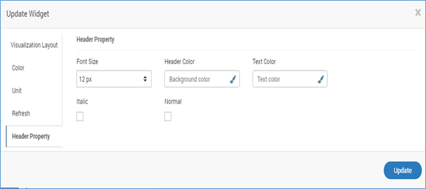
- Header Property: modify widget header property from given options

Clone Widget
The option will copy the same widget and its properties or conditions.
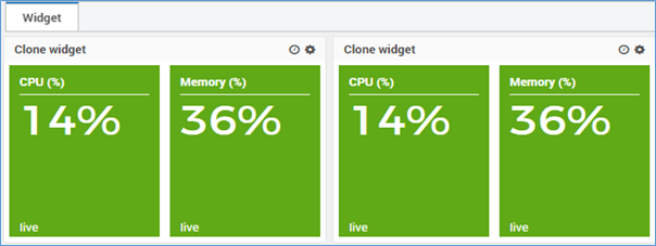
- The user can place the same widget at Dashboard or Report.
- The user can select the sub categories options and place the same widget at the dashboard or report location.
Edit Widget
You may edit the widget and configure its fields.
Remove Widget
You may delete the widget.
Full screen
You may go full screen of the widget.