2.3.4. Alert Trend (Last 6 Hours)
This section shows the graph of all the alerts that are generated in last 6 hours. Each vertical bar represents 1 hour time period. Hover over the vertical bars to see the severity, count and date of alerts occurred. You can download the graph into PNG, JPG or CSV format using the Download icon. The graph gives an overview of the overall status of the device types. Additionally you can click on the group name to see all the devices (and their details) in that group.
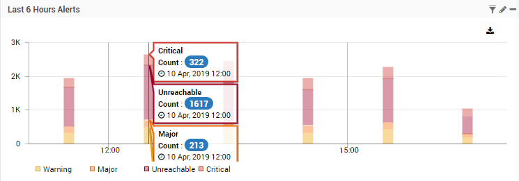
Alert Trend of Last 6 Hours
The following health statistics show up in this section. Here we have mentioned the default color codes. You can change the color codes from Admin > Actions section.
- Warning: (Yellow Color). This shows the count of the monitors in the warning state.
- Major: (Orange Color). This shows the count of the monitors in the major state.
- Unreachable: (Purple Color). This shows the count of the monitors in the unreachable state.
- Critical: (Red Color). This shows the count of the monitors in critical state.
Additional Read: Widget Options